Betting Odds Implied 2022 World Cup Group Stage Results
November 4, 2022
The World Cup
The World Cup, the world’s most viewed sporting event is right around the corner. Normally held in the summer months, this year the World Cup is being played in from mid-November to mid-December to avoid the scorching summer heat in host country Qatar. The sports analytics community will doubtlessly turn its attention to the World Cup and you’re likely see many World Cups prediction/forecasting models pop up over the next few weeks. I’m developing my own model which will release just prior to the beginning of the competition.
As I’ve started work on my model I wanted to identify a relatively easy way to “sanity check” the model predictions. In other words, are the predictions believable and do they “make sense”? Fortunately, betting odds are readily available for the World Cup and can be converted to probabilities. Let’s take a moment to see how we can go from betting odds to probabilities that a team will finish 1st, 2nd, 3rd, or 4th in their group and then effectively visualize these probabilities in an appropriate data visualization.
As a quick refresher, let’s review the basic format of the World Cup’s Group Stage. The Group Stage features 32 teams split into 8 groups (labeled A through H) of 4 teams. Teams that have qualified for the World Cup are drawn into the groups. The draw process is described on Wikipedia. Each team will play a match against the three other teams in their group. For example, the United States is in Group B and will play matches against Wales, England, and Iran. Winning a Group Stage match earns a team three points while a draw is worth one point. If two teams are tied on points after the Group Stage is completed a series of tiebreakers are available that are used to determine the rankings of teams in the groups. The top two teams by points after the matches are concluded advance to a 16-team Knockout Stage.
Converting Betting Odds to Implied Probabilities
For this phase of my work, I’m using betting odds from Bovada. Note that these odds are subject to change as bettors place their wagers and Bovada moves the odds in response. While Bovada provides a wide variety of potential bets for the World Cup, they only partially have odds for the finish position of teams in the groups. Here are the four sets of odds that we can use to extract odds for finishing position:
-
Odds to win the group (1st place)
-
Odds to finish last in the group (4th place)
-
Odds to advance out of the World Cup’s Group Stage to the 16-team Knockout Stage (1st or 2nd place)
-
Odds to fail to advance to the Knockout Stage (3rd or 4th place)
By default these odds are given by Bovada as American (Moneyline) odds. However, Bovada also allows odds to be displayed as Decimal odds. Decimal odds can then be easily converted to probabilities:
Probability = 1/Decimal Odds
For example, the host nation Qatar has Moneyline odds of +1800 to win their group (Group A). This means that a winning wager of $100 on Qatar to win Group A would return winnings of $1800. These odds are expressed in Decimal odds as 19. This implies that the total payout on a $1 wager would be $19 (the original $1 wagered plus $18 in winnings). Converted to a probability this yields:
Probability = 1/19 = 0.053
When expressed as a percentage, we can say that these odds give Qatar a 5.3% chance of winning (placing 1st in) Group A. Repeating this process for the three other teams in Group A yields the following probabilities (converted to percentages) to finish first in Group A:
| Team | % Chance Finishing 1st in Group |
|---|---|
| Netherlands | 66.7 |
| Senegal | 23.5 |
| Ecuador | 14.8 |
| Qatar | 5.3 |
If you did the math in your head (or on a calculator) you’ll notice that these percentages add up to a value greater than 100%. This is intentional and represents Bovada’s house edge or “vig”. We’ll need to normalize the probabilities to remove the vig and yield probabilities than sum to a value of 1 (or percentages that add to 100%). Fortunately, this is easy:
Normalized probability of a team finishing 1st = Probability of the team finishing 1st / Sum of all teams probabilities of finishing 1st
For Qatar this would would look like:
Normalized probability of Qatar finishing 1st = 0.053 / 1.103 = 0.048 (or 4.8%)
Repeating for the rest of the teams in Group A yields:
| Team | % Chance Finishing 1st in Group |
|---|---|
| Netherlands | 60.5 |
| Senegal | 21.3 |
| Ecuador | 13.4 |
| Qatar | 4.8 |
From this, we can see that Netherlands is the clear favorite to win Group A. A similar approach can be taken to find the probability that a team will finish last in its group. For example, the odds imply that Qatar has a 66.7% chance of finishing last in Group A. These probabilities are normalized in the same manner as the probability of finishing first in the group.
Finding the probability that a team will finish second or third in its group is a bit more tricky as we do not have the direct odds from Bovada for these finishing positions. However, with a little simple subtraction we can extract these probabilities:
Probability of 2nd Place Finish = Probability of advancing (finishing 1st or 2nd) - Probability of finishing 1st
Probability of 3rd Place Finish = Probability of failing to advance (finishing 3rd or 4th) - Probability of finishing 4th
These probabilities are then normalized as before. Here are the 2nd and 3rd place normalized probabilities (expressed as percentages) for Group A:
| Team | % Chance Finishing 2nd in Group | % Chance Finishing 3rd in Group |
|---|---|---|
| Netherlands | 23.6 | 12.0 |
| Senegal | 33.8 | 29.9 |
| Ecuador | 31.6 | 34.1 |
| Qatar | 11.0 | 23.9 |
Due to rounding, the percentages in each column may not sum to exactly 100.
We can now see the probabilities of each team finishing 1st, 2nd, 3rd, or 4th in their group. For Group A, the (almost) final probabilities are:
| Team | % Chance 1st | % Chance 2nd | % Chance 3rd | % Chance 4th |
|---|---|---|---|---|
| Netherlands | 60.5 | 23.6 | 12.0 | 2.5 |
| Senegal | 21.3 | 33.8 | 29.9 | 15.0 |
| Ecuador | 13.4 | 31.6 | 34.1 | 22.5 |
| Qatar | 4.8 | 11.0 | 23.9 | 60.0 |
While the probabilities sum to 1 in each column, they do not sum to 1 in each row (the probabilities a team finishes in each of the four positions). We also need to normalize by row. We can do this similarly to what we did above:
Normalized probability of a team finishing 1st = Probability of the team finishing 1st / Sum of probabilities of that team finishing 1st, 2nd, 3rd, 4th
Doing this normalization for each team yields a final table of probabilities for Group A:
| Team | % Chance 1st | % Chance 2nd | % Chance 3rd | % Chance 4th |
|---|---|---|---|---|
| Netherlands | 61.3 | 23.9 | 12.2 | 2.5 |
| Senegal | 21.3 | 33.8 | 29.9 | 15.0 |
| Ecuador | 13.2 | 31.1 | 33.6 | 22.1 |
| Qatar | 4.8 | 11.0 | 24.0 | 60.2 |
As before, rounding may lead to each row and each column not necessarily summing exactly to 100.
Visualizing the Implied Probabilities
Now that we finally have our probabilities, we have arrived at our visualization challenge. How can we concisely but clearly display the probabilities of each team finishing in each of the four positions in their group?
My first thought was to turn the ubiquitous analytics tool, Excel. A table with a little conditional formatting results in the table shown below (probabilities shown as percentages). The original table was quite long, so I made two tables side-by-side. In this table, green probabilities are associated with finishing 1st or 2nd in eaach group (i.e., advancing to the Knockout Stage). Red probabilities are associated with failing to advance. We can easily see which teams are strong favorites to advance (or to not advance). Most groups have a single, strong favorite to win the group except for Group E featuring Spain and Germany. The Excel file with this table is available on GitHub.
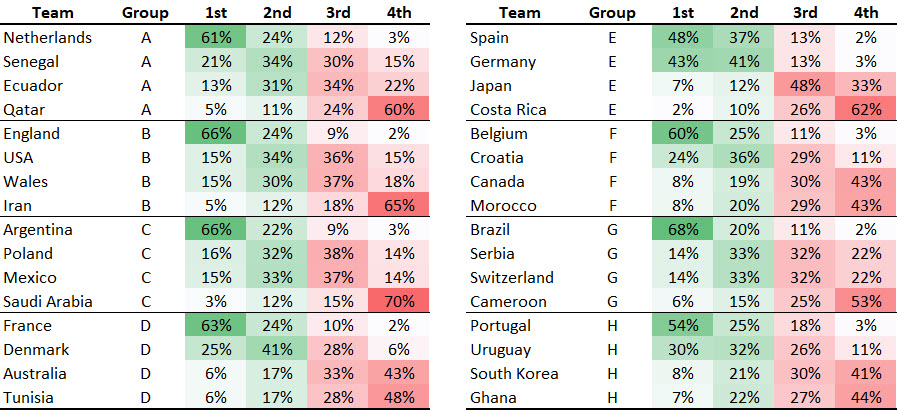
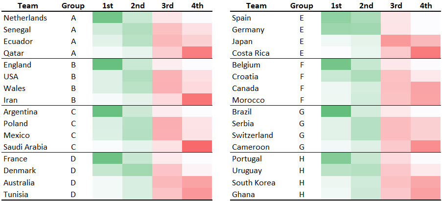
What do you like or not like about this table? A strength of a table is ability to show us precise values. Do we need to see any particular level of precision in this example? Do we lose much if we take the numbers away? Let’s see. We can make the numbers transparent using one of my favorite Excel formatting tricks (set the cell number format to Custom and enter “;;;” without the quotation marks as the custom format).
As much as I love Excel, let’s step beyond Excel and into R and see what the “gt” package (for tables) can do for us. The code to generate the tables below is available on GitHub.
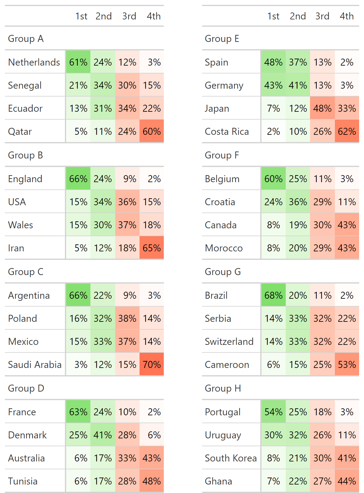 {width=“675”}
This table is a bit more compact and, perhaps, a bit “cleaner” looking. We can replicate the work we did in Excel and make the cell text transparent if we wish.
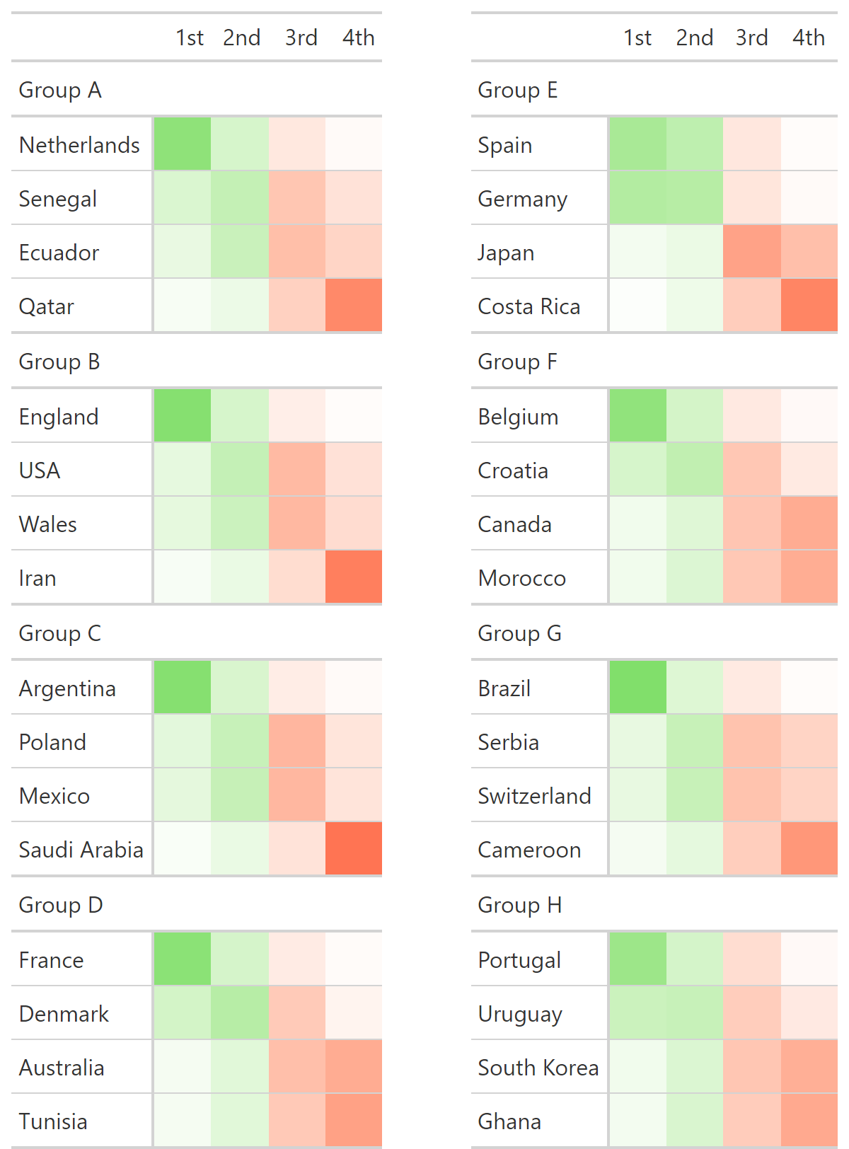 {width=“675”}
Do you prefer the Excel tables or the R table? With or without the values?
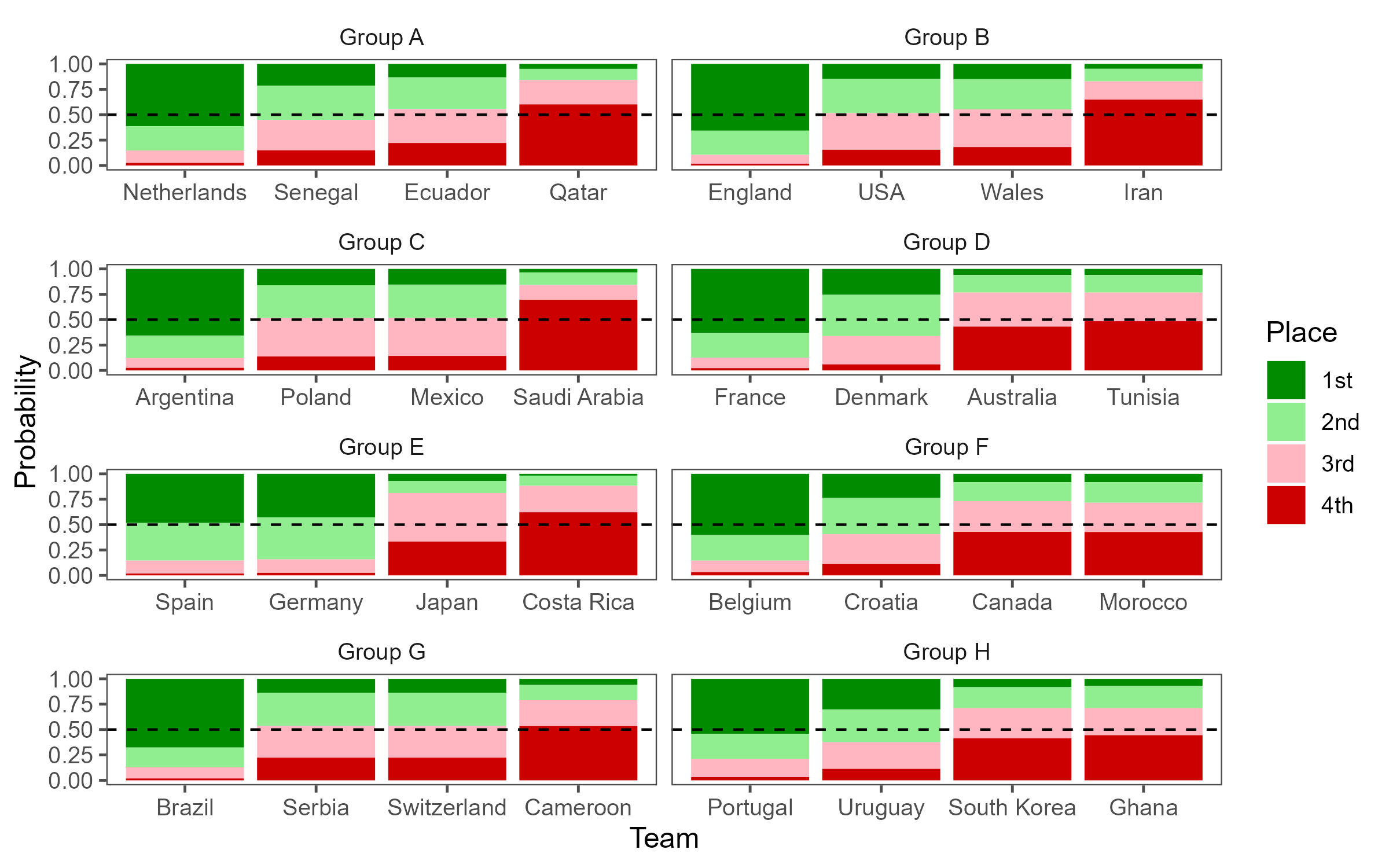
While a table seemed like the most appropriate visualization for this data, I did want to take a stab at creating a chart. I’m a fan of 100% stacked bar charts (as long as there aren’t too many categories in the stack). R’s “ggplot2” package makes the creation of such plots relatively easy. We can use the “facet_wrap” function to create separate plots for each group. The resulting plot is presented below. What are your thoughts on this visualization?
If you are interested in learning more about building predictive models, I invite you to consider the Master of Business Analytics (MSBA) program at the University of North Carolina Wilmington. For more information on this program visit UNCW MSBA. For other training or consulting opportunities contact me by email stephen@lllumined.io or visit Illumined Analytics.